
Technical outcomes
Prototyping and iteration
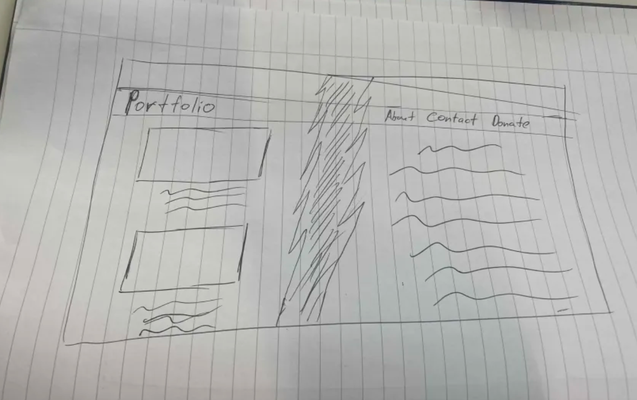
My idea for the site was to design it with two clear sections. One section would be for visual content, like images and prototypes, to showcase my work in an engaging way. The other section would focus on text-based explanations, where I could share details about my thought process and the steps I took during development. This setup creates a good balance between visuals and written information, making it easier for users to understand my work. To start with this idea, I created the following paper prototype:
I moved on to creating a digital version using Figma. This step helped me turn my rough ideas into a more polished design. In Figma, I could experiment with things like colors, fonts, and spacing to get a better sense of how the website would look. It also made it easier to test how the two-section concept would work and make changes if needed. This first Figma prototype became the starting point for building the actual website.
![]() for the full Figma prototype.
for the full Figma prototype.
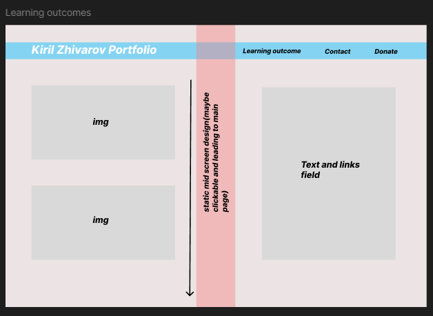
In this Figma prototype, I decided to rethink the layout after learning about the two key learning outcomes: technical and professional. Instead of dividing the site into sections with the left dedicated to images and the right to text, I restructured it to align with these outcomes. The left section now focuses on professional outcomes, combining text and visuals to present the related content clearly. Similarly, the right section is dedicated to technical outcomes.

![]() for the full Figma prototype.
for the full Figma prototype.
I had decided against having the middle design after feedback on all pages as it made them look unappealing and felt suffocating so i made another variation which was scrollable and displayed the content in a different way. I feel like this change made the site more open and gives more space for the users eye.
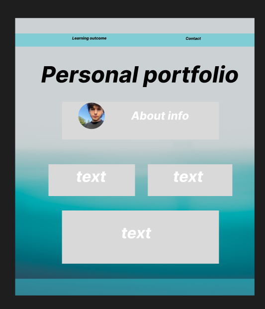
After the following feedback from one of my teachers i made a different variation of the Learning outcome page. The inline scrolling was making the user experience worse so i went a different path - i split the 2 outcomes in different pages so it can give more clarity and focus to the user and also to use the space in a more efficient manner. I believe this change made the user experience easier and challenged how i viewed my work up till now.
Portfolio work
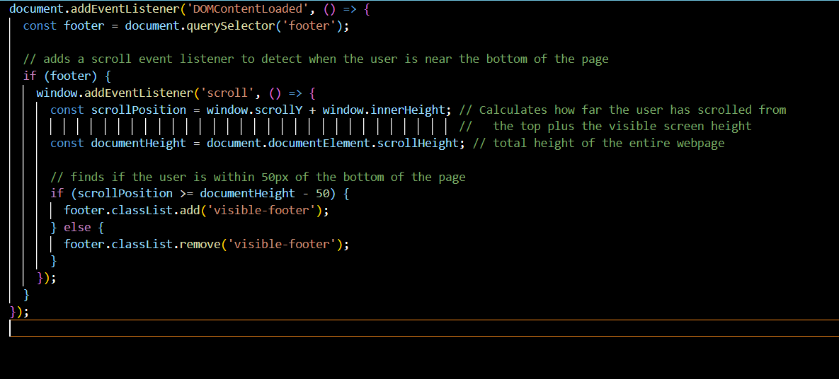
I used the video JavaScript Full Course for Beginners to help me get the skill to create a footer that appears when you scroll to the bottom of the page. The video gave me a basic understanding of how JavaScript works, especially how to use event listeners and interact with the page using the DOM. This way I managed to make the site a tiny bit interactive and followed the trend of microinteractions, which makes modern websites more responsive and pleasing to the eye, blending aesthetics with functionality.
Group Figma
During our group project, we agreed that each member would create their own design version of the website, ensuring the content on all pages remained consistent. Once all designs were completed, we held a vote to determine which version was the most visually appealing and best suited our project's goals. The following figma which i created was not chosen.
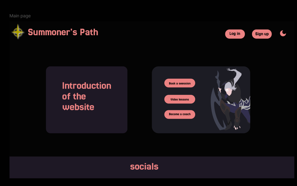
My Figma design was inspired by the clean and user-friendly layout of WeCoach.gg, which focuses on clear navigation and well-organized content. I used a cohesive color scheme and structured sections to make the site easy to use, similar to their approach.
![]() for the full Figma prototype.
for the full Figma prototype.
My part of the project
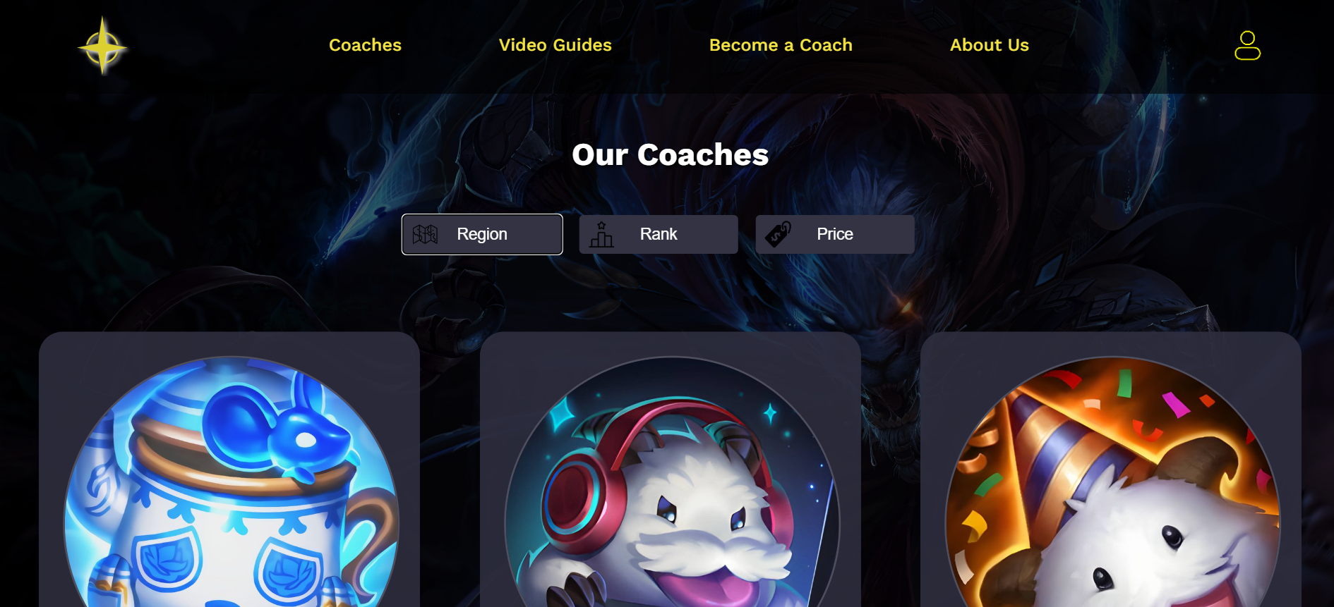
The part which i had to create for the League of Legends Coaching website was the coach selection page, a filtering system, detailed coach profile views, and a page for users to apply to become a coach. I followed the Figma prototype that my team and I developed to structure the website and define its features. With feedback from my team, I refined the layout and functionality to enhance navigation and user experience. I implemented features, such as a coach filtering system that allows users to sort coaches by region, rank, price, and developed detailed coach profiles with booking options. This hands-on coding process allowed me to build a functional and engaging website that effectively connects coaches with players in the gaming community.
![]() for the full project on Gitlab.
for the full project on Gitlab.
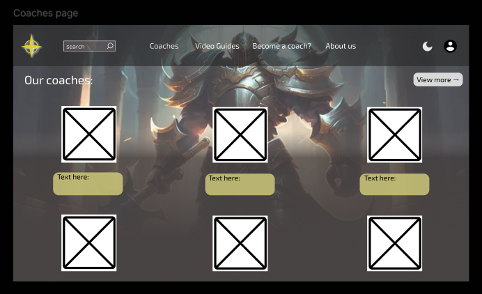
Below is the initial Figma we created with the team.
![]() for the full Figma prototype.
for the full Figma prototype.